The guide
A table number has two fronts, and one of them is printed upside down
A tent card is read from both sides of a crowded room, so the fold, the size of the numeral, the contrast and the paper all have to be settled before anything is printed.
- 180 degrees the turn given to the face printed above the fold
- 36 cards tables 1 to 37 with 13 left out, on 18 sheets
- 4.5:1 contrast the web guidelines ask of ordinary text
- 30 feet per inch the road-sign ratio of reading distance to letter height
- 0.006 inch the thickness at which bristol board begins
Read the full guide Fold the guide
A table number looks like the simplest piece of print at an event: one numeral on a small card. Yet every guest reads it from a distance, in poor light, while looking for somewhere to sit.
It also has a property almost no other printed thing has: it has no back. A guest may come at the table from any side of the room, so the card must say the same thing in both directions. That single demand decides how the card is printed, folded and cut, and it is the reason half of the artwork on the sheet has to be upside down.
Two faces from one fold
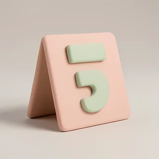
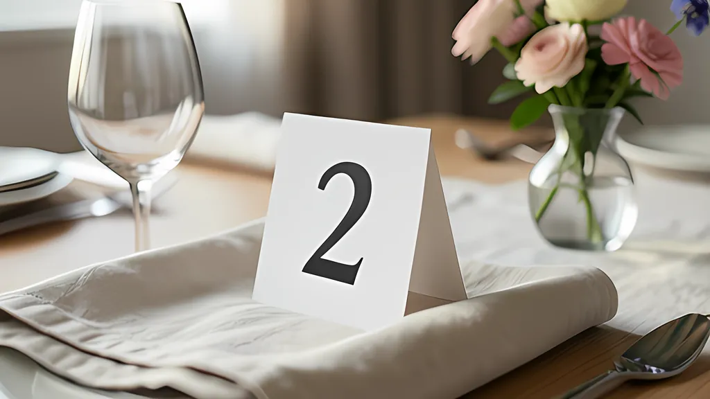
The usual answer is the tent card. A piece of stiff paper twice as tall as the finished face is folded once across its middle and stood on its two free edges, with the fold as a ridge on top. Nothing holds it up but its own shape. The two halves lean against each other like the sides of a roof, and each shows a face to one side of the room.
Now follow those faces back to the flat sheet. The face below the fold line is easy: it is printed the right way up, and when the card stands it is still the right way up. The face above the fold is different. Folding it backward turns it over about a horizontal line, so whatever pointed toward the top of the sheet now points at the tablecloth. To read correctly on the standing card it must be printed turned by 180 degrees, with its head against the fold.
This is easy to state and easy to get wrong. A layout that looks tidy on a screen, with both numbers upright, makes a card whose far side reads upside down. It can be checked without spending paper. Treat each half of the sheet as a rigid panel, swing both down from the ridge, and ask of each face which way its top points and whether it looks outward. The turned layout passes. The tidy one fails.
A flat card slipped into a holder solves the same problem by printing on both sides of the sheet, and it brings a different trap. A printer that prints both sides turns the sheet over on one of its edges. The Internet Printing Protocol names the two cases: long edge, sometimes called head-to-head, and short edge, called tumble or head-to-toe. The CUPS printing documentation recommends the long edge for upright pages and the short edge for pages on their side.
Choose the wrong one and every back is upside down, or sits behind the wrong card. So the back page has to be laid out for a stated flip: columns mirrored when the sheet turns about its upright edge, rows mirrored and each back turned when it turns about the other. Some printers turn the sheet themselves and others ask you to feed the stack again by hand, which is one more place for a set to go wrong.
How large is large enough
How big should the numeral be? Two public rules give a sense of scale, and they disagree in an instructive way. The federal manual for road signs in the United States asks for at least 1 inch of letter height for every 30 feet of legibility distance, which is where the shorthand 30 feet per inch comes from. It was written for signs read from the road.
The accessibility standard for signs inside American buildings is far more cautious. For a sign mounted between 40 and 70 inches above the floor it starts at 5/8 inch and adds 1/8 inch of character height for each foot of viewing distance beyond 72 inches. By that rule a numeral 2 inches tall is meant for a reader about 17 feet away. The road rule would credit the same numeral with 60 feet.
A dinner is not a highway, and a card on a tablecloth is not a sign on a wall. Neither rule was written for it. A fair reading is that the road figure is a ceiling for good light and the indoor figure is the prudent one. Both say the same thing about design: let the numeral take most of the face, and treat everything else on the card as secondary.
Fitting it is arithmetic, not taste. A browser can report the exact box of ink a string will make at a given size, measured from the baseline to the topmost and bottommost rendered points, and that box grows in proportion to the type size. The largest numeral that stays inside its frame is therefore a division. Do it for the widest number in the set and use that size for all of them, and a 7 and a 37 will look like members of one family.
That same accessibility standard has views on letterforms. Characters should be conventional in form, not italic, oblique, script or highly decorative. The capital O should be between 55 and 110 percent as wide as the capital I is tall, and the stroke of the I between 10 and 30 percent of its height. A hairline script numeral fails on every count, however elegant it looks on an invitation held at arm’s length.
Contrast in a dim room
Receptions are lit to flatter people, not print. The standard asks for light characters on a dark background or dark on light, and for a finish without glare. Its advisory note adds that shadows cast by lighting and glare from the surface both affect how easily text is told from its background. Candlelight supplies the first, and a shiny card the second.
Contrast can be given a number. The web accessibility guidelines define a ratio between the relative luminance of the lighter color and that of the darker, each with a small constant added. It runs from 1 for identical colors to 21 for black on white. The guidelines ask for at least 4.5:1 for ordinary text and 3:1 for large text, meaning 18 point, or 14 point bold, a point being 1/72 of an inch.
The reasoning behind the larger figure is worth knowing. The explanatory note says it was chosen to compensate for the loss of contrast sensitivity that usually comes with vision of about 20/40, which it describes as typical at roughly age 80. Most guest lists include someone for whom that is simply how the room looks.
Those figures were worked out for screens, which make their own light. Paper only reflects what falls on it, so it seems wise to treat a pair of colors that just passes on a monitor as a risk in candlelight. Pale gold on cream is the classic failure. The same note warns that fonts with unusually thin strokes are harder to read at low contrast, which is one more argument against the hairline script. A page can ask for a rounded or cursive system typeface, but the font specification itself says that a rounded one is not expected to exist on every platform.
Paper that stands, sheets that print
A tent card is a small structure, and thin office paper makes a poor one. The bookbinding literature describes cover papers as a class with good folding characteristics, commonly sold in basis weights of 50, 65 and 80 pounds. It describes bristol board as a lightweight board that begins at a thickness of 0.006 inch and is built up in plies. Either is the right family of material for something that must stand all evening.
The weights need care when comparing packs. Basis weight is the weight of a ream, normally 500 sheets, cut to the basic size for that grade, and the basic size for cover paper is 20 by 26 inches where book paper uses 25 by 38. Two papers with the same number on the label can therefore be quite different. Most other countries give the weight in grams per square meter, which avoids the problem.
Machine-made paper also has a grain, the direction in which most of its fibers lie, and it is stronger and more stable that way. A fold made at right angles to the fibers is said to be against the grain, and binders arrange their work to avoid it. Heavy stock should be scored first. Pressing a crease along the fold line, which can be done with a dull blade, compresses the fibers into a hinge and lets the sheet flex many more times before it fails.
Then there is the arithmetic of the sheet. Letter paper is 8.5 by 11 inches and A4 is 210 by 297 millimeters. An A4 sheet cut in half gives two sheets of the same proportions, because every size in that series has sides in the ratio of the square root of two. Letter does not behave this way: each halving swaps between proportions of 1.294 and 1.545. The same layout gives slightly different cards on the two papers, so judge a design on the paper it will be printed on.
Here is a set worked through. An event has tables numbered 1 to 37 and the hosts leave out 13, so there are 36 cards. On Letter paper with a half-inch margin to trim away, two medium tent cards fit side by side on a sheet turned on its side, each face 5 by 3.75 inches. Thirty-six cards at two to a sheet is 18 sheets. Each sheet needs five straight cuts and one fold per card. In a bold serif with the word Table above, the numerals come out about 1.45 inches tall: some 43 feet by the road rule, nearer 13 by the indoor one.
What a number says
Leaving out 13 is not eccentric. Fear of the number is old enough to have a name, and one of its origin stories is about thirteen people at a table. An elevator company estimated in 2002 that 85 percent of the tall buildings it served had no floor named the thirteenth. Where the word for four sounds like the word for death, as it does in Chinese, floor 4 goes the same way. A range with gaps is an ordinary request, not a special case.
Names are the other habit. A family name tells a guest more than a numeral does, but a long name must shrink to fit a face that a single digit would fill. A large number with a small name beneath it keeps both.
What none of this can do is test the print. A rigid model proves which way each face ends up. It cannot say whether a given stock will stand without bowing, whether your printer lines up the two sides of a sheet closely, or how the colors look on that paper under that light. Print one sheet, fold one card and carry it across the room before printing the other seventeen.
Sources
Every source consulted for this guide. Links checked October 4, 2026.
- Web Content Accessibility Guidelines (WCAG) 2.2 World Wide Web Consortium (W3C)
- Understanding Success Criterion 1.4.3: Contrast (Minimum) W3C Web Accessibility Initiative
- Chapter 7: Communication Elements and Features U.S. Access Board, ADA Accessibility Standards
- Chapter 2A - MUTCD 2009 Edition - FHWA Federal Highway Administration, Manual on Uniform Traffic Control Devices
- Internet Printing Protocol/1.1: Model and Semantics (RFC 8011) Internet Engineering Task Force
- Command-Line Printing and Options CUPS documentation
- Duplex printing Wikipedia
- CSS Paged Media Module Level 3 World Wide Web Consortium (W3C)
- CSS Values and Units Module Level 3 World Wide Web Consortium (W3C)
- CSS Fonts Module Level 4 World Wide Web Consortium (W3C)
- HTML Standard WHATWG
- A4 paper format / International standard paper sizes Markus Kuhn, University of Cambridge Computer Laboratory
- Etherington & Roberts. Dictionary--cover papers Bookbinding and the Conservation of Books (1982), electronic edition at Conservation OnLine
- Etherington & Roberts. Dictionary--bristol board Bookbinding and the Conservation of Books (1982), electronic edition at Conservation OnLine
- Etherington & Roberts. Dictionary--basis weight Bookbinding and the Conservation of Books (1982), electronic edition at Conservation OnLine
- Etherington & Roberts. Dictionary--machine direction Bookbinding and the Conservation of Books (1982), electronic edition at Conservation OnLine
- Etherington & Roberts. Dictionary--against the grain Bookbinding and the Conservation of Books (1982), electronic edition at Conservation OnLine
- Etherington & Roberts. Dictionary--score Bookbinding and the Conservation of Books (1982), electronic edition at Conservation OnLine
- Triskaidekaphobia Wikipedia