
The guide
Most signs fail before anyone reads them: the letters were sized for the desk
A sign is a distance problem. How tall its letters must be depends on where the reader stands, how sharp their eyes are and how far apart the two colors sit, and published rules put numbers on all three.
- 1 inch per 30 feet the letter height ratio in the US manual for road signs
- 5/8 inch smallest character in the US accessibility table, under 6 feet away
- 5 minutes of arc the angle a letter on the 20/20 line of an eye chart covers
- 21:1 the highest contrast ratio there is, black on white
- 15 percent extra letter height the Sign Council index asks of all capitals
Read the full guide Fold the guide
The notice goes up beside the lift: a bold headline and a paragraph beneath it, composed at arm’s length on a screen. From across the lobby it is a pale rectangle with a dark smudge in the middle.
Nothing was wrong with the wording. The letters were sized for the person who made the sign, sitting two feet from a monitor, and then asked to work for a stranger standing twenty or thirty feet away. That gap is the most common fault in a home-printed sign. It is also the easiest to put a number on, because reading at a distance is a matter of angles, and people have been measuring those angles for a very long time.
A sign, then, is a distance problem first and a design problem second. Decide where the reader will stand. The letter height follows from that, and nearly everything else follows from the letter height.
The eye sets the scale
The familiar eye chart is built on an angle. On the line marked 20/20, each letter is sized so that at the test distance it covers 5 minutes of arc, a twelfth of a degree, and each stroke and each gap within it covers one minute. At 6 meters that makes the letters 8.73 mm tall. The fraction itself is a comparison between people. Someone with 20/40 vision can just make out, from twenty feet, the letters that an average eye makes out from forty.
Not everyone reads the 20/20 line. In a United States health survey of 1960 to 1962, reprinted in the federal report described next, about 54 percent of adults reached it without glasses and about 73 percent with whatever glasses they brought to the test. Federal highway researchers call 20/40, with or without corrective lenses, the predominant minimum standard for a driving licence across the United States. A sign for the public has to work for the eyes that actually arrive.
In 1983 Gerald Howett of the National Bureau of Standards turned the eye chart into a sizing formula for signs, in a report sponsored by the Occupational Safety and Health Administration. The stroke of a letter must be at least 0.0000145 times the viewing distance times the bottom number of the reader’s Snellen fraction, with stroke and distance in the same unit. Letter height is then the stroke multiplied by the typeface’s ratio of height to stroke width. Snellen letters are five strokes tall, and the report notes that handbooks most often recommend six to ten. The formula assumes black letters on a white, well lit background, and the report supplies corrections for anything less.
Sign engineers compress this into one figure, the legibility index: the distance at which a sign can be read divided by its letter height, in feet per inch. A higher index means more distance from the same letter.
What the published rules say
For decades the working figure on American roads was 50 feet of distance for each inch of letter. A Federal Highway Administration handbook on older drivers calls that value nominal, arbitrary and disputed. It corresponds, the handbook says, to 20/25 vision, which is beyond roughly 40 percent of drivers aged 65 to 74. The same handbook reports one researcher’s conclusion that the most conservative standard would be 30 feet per inch, which corresponds to 20/40. The current edition of the road sign manual states that figure as guidance: a minimum ratio of 1 inch of letter height per 30 feet of legibility distance.
The United States Sign Council Foundation, which studies shop and business signs, also offers 30 as an average index, and then warns that an average may fall short for any particular sign. Its test-track values dropped by at least 35 percent in real traffic, with extremes as low as 7 feet per inch in highly complex surroundings. Thirty feet per inch is a floor measured under kind conditions.
Indoors, the most detailed American rule is a table in the 2010 ADA Standards for Accessible Design. It sets the minimum height of visual characters from two things: how high the baseline of the text sits above the floor, and the horizontal distance to the nearest point where a reader can stand. For text 40 to 70 inches up, the minimum is 5/8 inch when the reader can come within 6 feet, plus 1/8 inch for every further foot. Text mounted higher starts at 2 inches, and text more than 10 feet up at 3 inches. Height is measured on the uppercase letter I, not on the nominal font size.
Take a sign whose text sits at eye level and will be read from 10 feet. The table gives 5/8 inch plus four more eighths: 1 1/8 inches, about 29 mm. At 30 feet it gives 3 5/8 inches. The road rule, 1 inch per 30 feet, asks for a single inch at that same distance. The two are not in conflict. One is written so that people with low vision can use a building; the other describes what a licensed driver can read in a purpose-built alphabet. Set the viewing distance in the tool above to 10 feet and it reports the same minimum, rounded to 1.13 inches.
Either way, the letters come out far larger than instinct suggests. Instinct was trained on documents held in the hand, not on walls.
Contrast, color and the shape of letters
Size is wasted if the letters do not stand out from their background. The Web Content Accessibility Guidelines define a contrast ratio from the relative luminance of two colors, running from 1:1 for identical colors to 21:1 for black on white. Their explanatory notes tie the thresholds to eyesight. A ratio of 4.5:1 compensates for the contrast sensitivity usually lost at about 20/40 vision and 7:1 at about 20/80, while 3:1 is the minimum that older ergonomic standards recommend for ordinary text and ordinary vision. The ratio was written for screens. It is still a convenient, repeatable way to compare the two colors of a paper sign before any ink is spent.
The accessibility standards take a plainer line: light characters on a dark background or dark characters on a light one, with a non-glare finish. The Access Board’s guide adds that no minimum contrast is specified because reflectance is hard to measure in the field, that higher contrast is better, and that variegated or textured backgrounds compromise readability.
The same standards describe the letters themselves. They must be conventional in form, not italic, oblique, script or highly decorative. The uppercase O must be between 55 and 110 percent as wide as the uppercase I is tall, and strokes must be between 10 and 30 percent of the letter height. The six-to-ten ratio from the Bureau of Standards report sits inside that range. Hairline and tightly squeezed faces fall outside it, which is the practical argument against them at distance: Howett’s critical detail is the stroke, and a stroke too thin to resolve takes the letter with it.
Capitals are not automatically louder. The Sign Council’s index builds in 15 percent more letter height when a message is set entirely in capitals instead of capitals and lowercase, a penalty it attributes to earlier studies of recognition distance. The road manual sets the names of places and streets in mixed case, with lowercase loops three quarters as tall as the initial capital.
Printing bigger than the printer
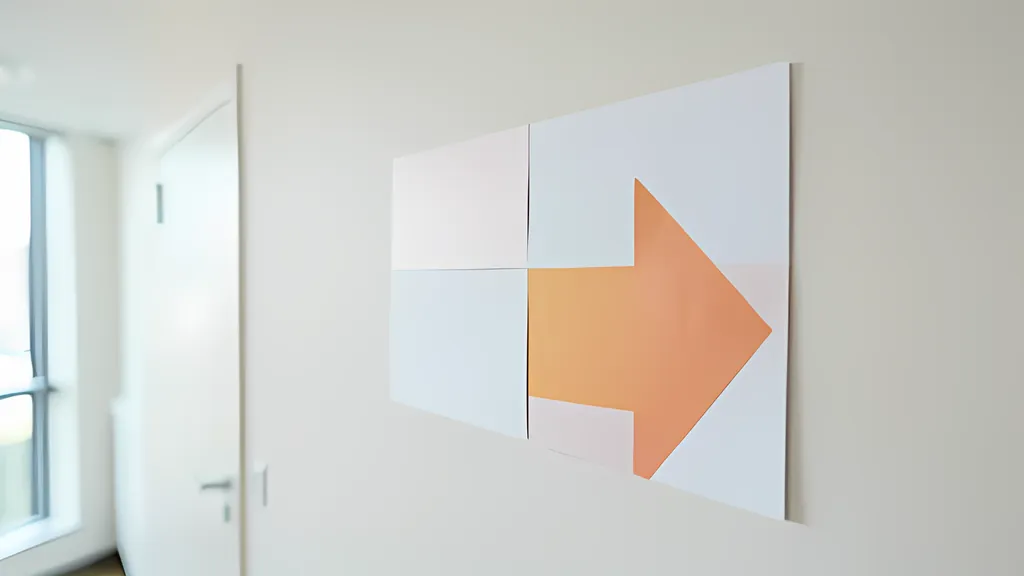
Honest letter heights soon outgrow a single sheet. A message read from 30 feet under the accessibility table needs capitals 3 5/8 inches tall, and a few words at that size want a poster, not a page. The home answer is tiling: cut the artwork into pieces that each fit the printer, print them at full size, and join them. The idea is old enough to have its own Unix utility, poster, whose manual describes output pages that bear cut marks and have slightly overlapping images for easier assembling. The paper is standardized too. An A0 poster is one square meter, the area of sixteen A4 sheets.
No desktop printer reaches the edge of the paper. The CSS specification for paged media calls the strip that a device cannot mark reliably the non-printable area, and the poster manual warns that its cut margin must be big enough to cover the margin which almost all printers have. So each tile is smaller than its sheet, and neighbors repeat a narrow band of the picture so that a slightly crooked cut does not open a white gap.
A tabloid sign, 17 by 11 inches, shows the arithmetic. On Letter paper, allow a quarter inch that the printer cannot reach, a quarter inch for cut marks and a half-inch overlap. The sign then takes four sheets, two across and two down, each carrying a piece 8.75 by 5.75 inches. The manual’s assembly method still serves: lay the sheets out in order, trim the margins that will be covered, glue each sheet over its neighbor’s overlap, then turn the poster face down and tape the joins on the back. Print at full size with every scaling option switched off, and check the first tile against a ruler before printing the rest.
Paper and finish matter more on a wall than on a desk. Ordinary office paper weighs about 80 grams per square meter, so a full A0 poster of it weighs 80 grams: easy to hang, and flimsy enough to deserve a stiff backing. Gloss is the other trap. The accessibility standards ask for a non-glare finish, and their advisory note lists surface glare and the shadows cast by lighting among the things that make text hard to tell from its background.
Where a home-made sign stops
Some signs are specified by law, and a printed sheet does not become one of them by being legible. In American workplaces, federal rules fix the colors of a caution sign, a yellow background and a black panel with yellow letters, and require rounded or blunt corners; they exempt bulletin boards and safety posters from those specifications. An exit sign must carry its word in letters at least six inches high, with strokes three quarters of an inch wide, and must be lit. British guidance likewise treats safety signs as a legal duty with harmonised designs. Signs that label permanent rooms under the accessibility standards need raised characters and braille, which no inkjet lays down.
The letter-height rules have limits of their own. They assume a reader who is looking, standing still, with the sign square-on and decently lit. They say nothing about whether the sign is noticed among others, whether its wording is understood, or how long a passing driver has to read it. The Sign Council’s field figures show how quickly a tidy index decays in a busy scene, and the British guidance warns that too many signs cause confusion. A calculation can tell you that a letter is too small. It cannot tell you that a sign works.
That still leaves most of what people print: directions for an event, a notice on a shop door. The Access Board’s guide lists temporary signs, posted for seven days or less, among those it exempts. They are exempt from the rule, not from the reader’s eyesight.
Measure the distance before choosing the font. Pace out where people will stand, work out the letter height, and let the paper grow to fit. The result looks too big on the desk. On the wall it looks right.
Sources
Every source consulted for this guide. Links checked October 3, 2026.
- ADA Accessibility Standards U.S. Access Board
- Chapter 7: Signs U.S. Access Board, Guide to the ADA Accessibility Standards
- MUTCD 2023 Chapter 2A Federal Highway Administration, Manual on Uniform Traffic Control Devices, 11th Edition
- I. Intersections (At-Grade) - Highway Design Handbook for Older Drivers and Pedestrians, May 2001 - FHWA-RD-01-103 Federal Highway Administration
- USSC Foundation Best Practice Standards for On-Premise Signs United States Sign Council Foundation
- Size of letters required for visibility as a function of viewing distance and observer visual acuity National Bureau of Standards, Technical Note 1180 (G. L. Howett, 1983)
- Supplemental Technical Notes - Guidelines And Recommendations To Accommodate Older Drivers and Pedestrians, May 2001 - FHWA-RD-01-051 Federal Highway Administration
- Snellen chart Wikipedia
- Web Content Accessibility Guidelines (WCAG) 2.2 World Wide Web Consortium (W3C)
- Understanding Success Criterion 1.4.3: Contrast (Minimum) W3C Web Accessibility Initiative
- G18: Ensuring that a contrast ratio of at least 4.5:1 exists between text (and images of text) and background behind the text W3C Web Accessibility Initiative
- 1910.145 - Specifications for accident prevention signs and tags. Occupational Safety and Health Administration
- 1910.37 - Maintenance, safeguards, and operational features for exit routes. Occupational Safety and Health Administration
- Safety signs and signals. The Health and Safety Regulations 1996. Guidance on Regulations Health and Safety Executive
- A4 paper format / International standard paper sizes Markus Kuhn, University of Cambridge Computer Laboratory
- CSS Paged Media Module Level 3 World Wide Web Consortium (W3C)
- poster - Scale and tile a postscript image to print on multiple pages Debian Manpages