Mastering Color Accessibility for Eye-Popping Designs
Color accessibility isn't just a trend; it's a must for inclusivity. Learn how to make your designs pop while ensuring everyone can enjoy them.
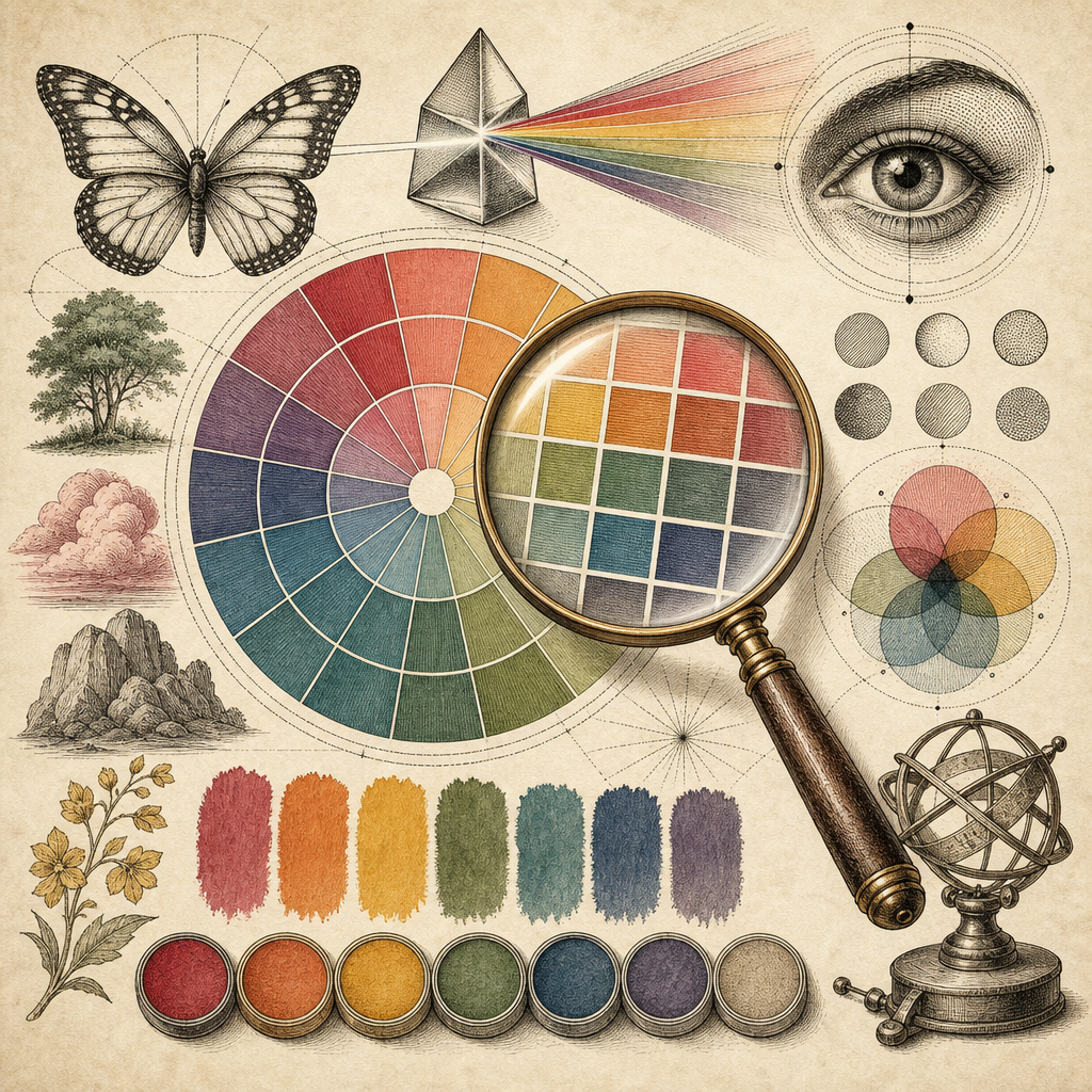
Imagine you’re at the world’s most extravagant buffet. There’s sushi, there’s an entire roasted pig, there’s a chocolate fountain taller than you are - it’s every foodie’s dream. But, you can’t taste any of it because your taste buds suddenly decided to take the day off. That’s what web browsing feels like for those grappling with poor color accessibility. They’re served a platter of content, but the flavors - or in this case, the colors - are lost.
The Color of Accessibility
Color accessibility isn’t a dazzling new trend; it’s the bread and butter of inclusive design. Approximately 8% of men and 0.5% of women (oh yes, it’s not just the guys) globally experience color blindness. That’s millions of people who might see your beautiful blue button as a dull gray or your vivid red alert as a nonchalant beige.
To check your designs for accessibility, Accessible Color Generator is a fantastic starting point. This delightful tool ensures your color contrasts are up to snuff, so everyone - color blind or not - can enjoy the full visual feast.
Avoiding the Color Chaos
Designers often juggle colors like circus performers - bold reds, soothing blues, lively greens - but a poorly chosen palette can be like a comedy show gone wrong. Imagine a horror movie with pastel colors. Yikes! That’s why using Color Palette Generator, which helps craft harmonious and accessible color palettes, is essential.
Moreover, simulating color blindness with tools like the Color Blindness Simulator gives you a peek into how people with color vision deficiency perceive your designs. This is like trying out a VR set before buying it - you wouldn’t want to commit without knowing the full experience.
The Magic of Contrast
Contrast is like the season finale of your favorite show - it needs to be just right. Too little contrast and your text might as well be incognito. Too much, and it’s shouting at your audience like a caffeine-fueled motivational speaker.
The Web Content Accessibility Guidelines (WCAG) suggest a minimum contrast ratio of 4.5:1 for normal text. This isn’t just a suggestion from a random enthusiast; it’s backed by standards. You can read more about these guidelines here.
Designing for Everyone
Accessibility isn’t a burden; it’s an opportunity to innovate. By addressing color accessibility, you’re not just catering to a previously overlooked audience; you’re showing off your design’s true potential.
Consider using the Typography Scale Generator to ensure your text is legible for all. This tool complements color contrast by focusing on another crucial design aspect.
Be the Change
Whether you’re a seasoned designer or a curious newbie, embracing color accessibility sets you apart as a thoughtful creator. It’s not about drastic overhauls but about mindful adjustments that make a world of difference.
Now, if this post has you itching to tweak your designs, head over to b2KIT and explore a plethora of tools that make design not just about looks but also about accessibility and inclusivity. You’ll find your designs can be both eye-catching and universally appreciated.