Mastering Mobile-First Design: The Small Screen Revolution
Dive into mobile-first design and learn how to create sleek, responsive digital experiences. Explore powerful tools and tips to enhance your designs.
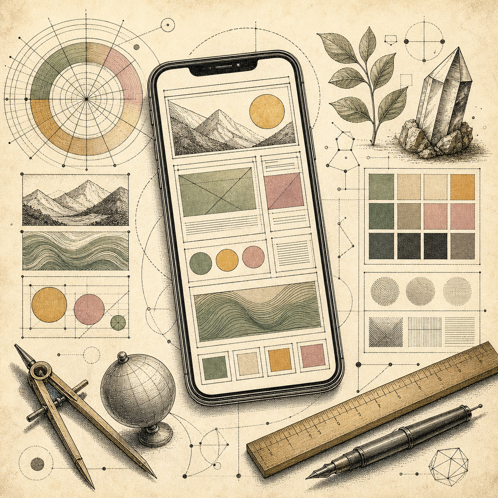
Picture this: You’re in a crowded coffee shop, sipping on the world’s most overpriced latte, and you notice everyone around you engrossed in their mobile devices. It’s like a digital symphony of swipes, taps, and pinches. You realize then that mobile-first design isn’t just a trend; it’s the future of web design. According to recent studies, over 60% of web traffic now originates from mobile devices. If your website isn’t optimized for these small screens, you’re essentially inviting your audience to a digital ghost town.
The Art of Small Screen Mastery
Mobile-first design isn’t just about making things smaller, it’s about rethinking the entire user experience. When you’re designing for the small screen, every pixel counts. It’s like packing for a weekend getaway in a carry-on bag - you must prioritize essentials and leave the fluff behind. Use the Color Palette Generator to ensure your color schemes remain impactful across different devices.
Break Free from the Grid
When it comes to layout, flexibility is your new best friend. Responsive grids are like the stretch pants of web design - accommodating and comfortable. Use the CSS Grid Generator to create layouts that look stunning no matter what the screen size. Remember, a rigid design is a broken design when viewed on a mobile device.
Color It Right, Every Time
Achieving visual harmony across various devices can be a daunting task. But you wouldn’t wear mismatched socks to an important meeting, would you? Ensure consistency and accessibility with the Accessible Color Generator and put your designs through the Color Blindness Simulator for good measure. It’s all about making your colors not just pretty, but perfectly legible.
The Importance of Speed
Speed is crucial in mobile design - it’s like the fast food of digital experiences. Your users expect content served hot and quick. When designing, trim the fat. Use tools to enhance performance and ensure images are optimized. According to Google’s mobile page speed insights, improving load times can reduce bounce rates significantly.
Staying Ahead with Typography
Typography on mobile devices can make or break the design. The Typography Scale Generator helps you maintain readability without sacrificing style. It’s like having a tailor for your text, ensuring every word fits perfectly on the screen.
Designing for mobile-first isn’t just about adaptation; it’s about innovation. Embrace these tools and tips to create designs that are not only responsive but resonate with users on a deeper level.
Ready to revolutionize your approach to design? Whether you’re crafting your first mobile-friendly site or a seasoned pro, b2KIT’s vast array of tools can offer the support and inspiration you need for your next big project. Dive in, experiment, and let your creativity shine on every screen size.