Dark Mode Design: Illuminating the Secrets of Shadows
Explore dark mode design's allure, delve into its secrets, and harness tools for accessible, striking visuals. Discover hidden design magic!
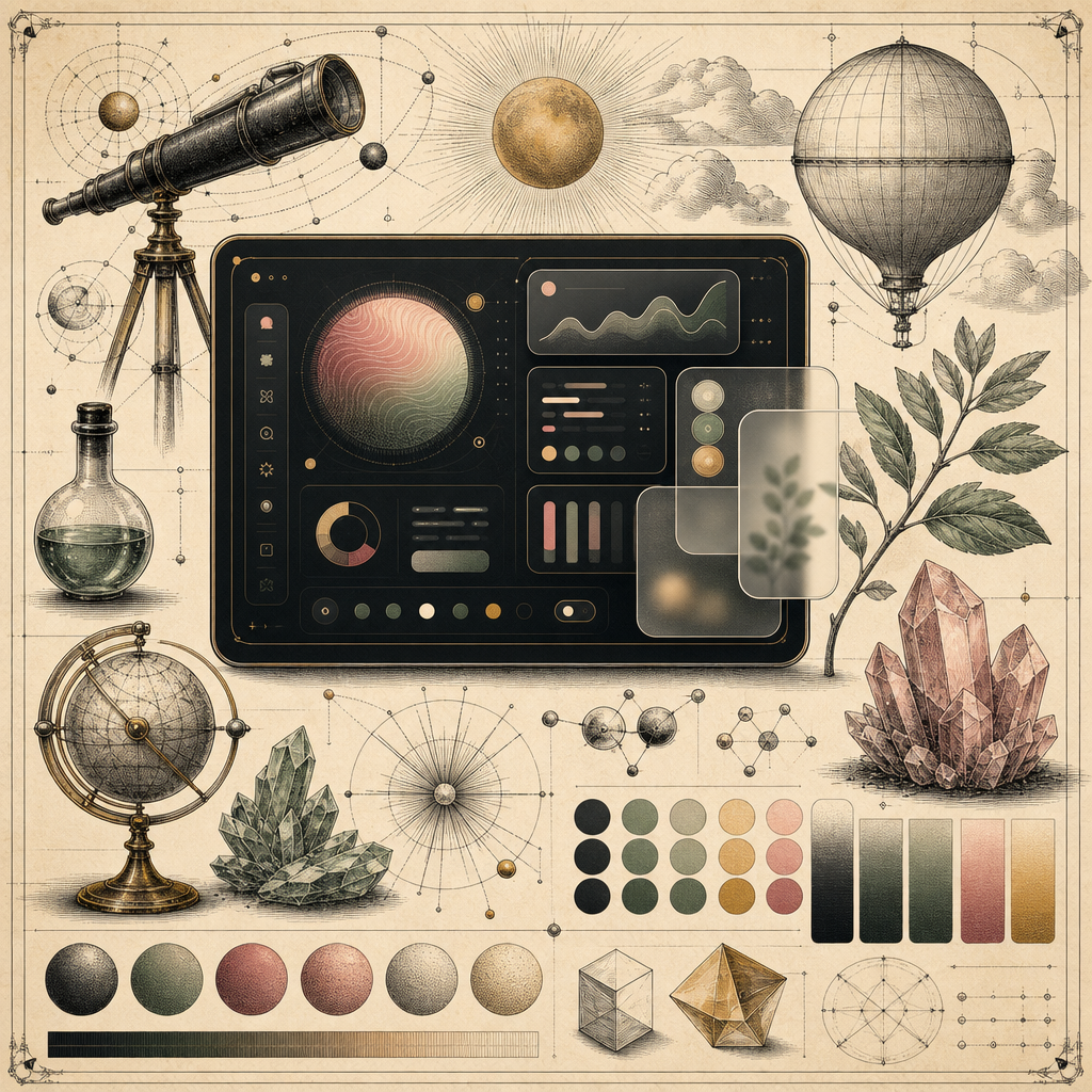
Picture this: You’re in a dimly lit room, the kind with a sultry ambiance and ambient jazz playing in the background. Your computer screen glows with the soft, mysterious allure of dark mode. It’s like your digital world is swathed in velvet, whispering secrets of sophistication. But dark mode design isn’t just about aesthetics; it’s a science - a delicate dance of light and shadow that’s capturing the imagination of designers worldwide.
Why Everyone’s Flipping the Dark Mode Switch
Dark mode isn’t just a trend; it’s becoming a design staple. With roughly 70% of users flipping the switch to dark mode on their devices, it’s clear that this isn’t a fleeting fancy. But what’s the real draw? It’s more than the undeniable cool factor - dark mode can reduce eye strain, save device battery life, and even improve readability under certain conditions.
When done right, dark mode design can elevate user experience by creating a focused, calming environment for content consumption. But beware, missteps in color contrast and readability can turn your website into a black hole of unreadable text. That’s why understanding the interplay of colors is crucial.
Mastering the Dark Arts: Color Contrast and Accessibility
Choosing the right color palette in dark mode design isn’t as simple as picking your favorite shades and slapping them onto a black background. Contrast is king. According to WCAG guidelines, ensuring sufficient contrast between text and background is vital for readability and accessibility.
Tools like the Accessible Color Generator can help you craft visually striking yet accessible palettes. With it, you can test color combinations to ensure they meet accessibility standards, keeping your design both beautiful and barrier-free.
Don’t Let Color Blindness Be Your Kryptonite
With approximately 8% of males and 0.5% of females suffering from color blindness, ensuring your design is inclusive is paramount. Utilize the Color Blindness Simulator to see your design through the eyes of someone with color vision deficiency. This step ensures your text and important elements remain clear to all users, boosting your design’s universality.
Typography in Dark Mode: The Bold and the Beautiful
Typography is more than the cherry on top of your design sundae-it’s the whole dessert. In dark mode, fonts can either pop with elegance or fade into oblivion. It’s all about balance and contrast.
When selecting typography, consider using the Font Preview Tool to visualize how different fonts will appear in dark mode. Opt for bold, readable typefaces that maintain clarity against darker backgrounds. Avoid excessively thin fonts, as they may lose their legibility under the shadowy spell of dark mode.
Embracing Glassmorphism and Soft Neumorphism
If you want to push the envelope and dive into the latest design trends, consider integrating glassmorphism effects into your dark mode design. This style uses frosted glass-like elements that provide a sense of depth and intrigue. The Glassmorphism Generator is your go-to resource for creating these ethereal effects.
Similarly, soft neumorphism can add a touch of realism, making buttons appear as though they’re perfectly molded from the screen itself. It’s these little details that give your design that polished, professional finish.
The Shadowy Finale: Perfecting Dark Mode
Designing in dark mode is like crafting a symphony of shadows and light. It requires a keen eye for detail and a toolkit of powerful resources. Remember to test your designs across devices and lighting conditions to ensure they look impeccable anywhere, anytime.
Ready to dive into the dark side? Start experimenting with b2KIT’s tools to bring your dark mode visions to life. Trust me, your designs will thank you, and so will your users.
In the world of design, the night is young and full of possibilities. Explore the shadows, and you just might illuminate your brand’s best look yet.