Dark Mode Everything: The Science Behind Why We're All Vampires Now
Why dark mode took over the internet, when it actually helps (and when it doesn't), and how to design for both modes without losing your mind.
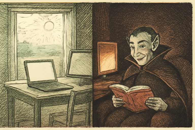
Somewhere around 2019, the entire internet decided that white backgrounds were out and we’d all become digital vampires. Dark mode went from a developer preference to a global movement. Your phone has it. Your browser has it. Your smart fridge probably has it.
But does it actually do anything? Let’s look at the science.
The Eye Strain Question
The biggest claim: dark mode reduces eye strain. The truth? It depends.
In low-light environments (your bedroom at 2 AM, we’ve all been there), dark mode genuinely helps. A bright white screen in a dark room forces your pupils to rapidly contract, which causes discomfort over time. Dark mode reduces that contrast.
In well-lit environments? Light mode is actually easier to read. Our brains evolved to read dark marks on light surfaces (ink on paper, anyone?). Studies show reading comprehension and speed are slightly better with dark text on light backgrounds in daylight.
The Battery Argument
On OLED screens, dark mode saves real battery. Black pixels on OLED are literally turned off. Google found that dark mode on YouTube’s OLED display at 100% brightness saves about 60% power.
On LCD screens? Zero difference. The backlight runs regardless of what’s on screen.
How to Actually Design for Dark Mode
If you’re building something that supports both modes, here’s what matters:
- Don’t just invert colors. Pure white (#FFFFFF) on pure black (#000000) is actually harder to read than slightly off-white on dark gray. Use soft contrasts.
- Check your contrast ratios. WCAG requires 4.5:1 for normal text. Use a contrast checker to verify both modes pass.
- Generate a full palette. Start with your brand color and use a color palette generator to create variants that work on both light and dark backgrounds.
- Build a system. A design system generator can create consistent component styles for both modes from a single brand color.
The Real Reason We Love Dark Mode
Honestly? It looks cool. A dark UI feels modern, sleek, and “pro.” There’s a reason every developer tool, code editor, and terminal defaults to dark. It signals “I know what I’m doing” even when you’re Googling basic syntax.
And there’s nothing wrong with that. Aesthetics matter. If dark mode makes you enjoy using your devices more, that’s reason enough.
When to Force Light Mode
Some content genuinely works better in light mode:
- Long-form reading. Articles, documents, books. Light background wins for sustained reading.
- Color-critical work. Design, photo editing. Colors look different on dark backgrounds.
- Printing. Nobody prints dark mode. Check your print color preview before sending anything to paper.
The Bottom Line
Dark mode is great at night, on OLED screens, and for looking cool. Light mode is better for reading, color work, and daytime use. The correct answer is: support both and let people choose.
Now please, go update your app to support both modes. We’re begging you.